Sunday, 9 September 2018

Cambridge 12 Test 6 (Maps)


You should spend about 20 minutes on this task.

The maps below show the centre of a small town called Islip as it is now, and plans for its development.

Summarise the information by selecting and reporting the main features, and make comparisons where relevant.

Write at least 150 words.


SAMPLE ANSWER:

Source: essayforum

The maps compare the changes in the town center of Islip between at present and in the future.
It is clear that there will be more facilities constructed in the center of Islip. Besides, a new infrastructure will be built in order to replace the old one.

Compared with the present map, the main road will be restricted for pedestrians. And a new dual carriageway which runs around the whole city center are planned to be built.

Moreover, shops located on the northern side of the main road at present will be planned to be demolished in the aim of constructing some new facilities. There will be four new blocks such as bus station, shopping center, car park and new housing. Meanwhile, opposite shops, situated on the southern side of the main road, will not be damaged. However, there will be newly built housing and the park of the city will be reduced in size.

155 words


Cambridge 12 Test 5 (Bar Chart)

You should spend about 20 minutes on this task.

The bar chart below shows the percentage of Australian men and women in different age groups who did regular physical activity in 2010.

Summarise the information by selecting and reporting the main features, and make comparisons where relevant.

Write at least 150 words.


Percentage of Australian men and women doing
regular physical activity: 2010

SAMPLE ANSWER:
Source: thewonderfulworldofjazz
The visual information represents the proportion of physically active males and females from 15 to 65 years old and over in Australia in the year 2010. It can be noted from the graph that women exercised more than men.

There was an evidence of a gradual increase in the number of women who regularly worked out while men showed a significant decrease in percentage. More than 50 percent of men from 15 to 24 exercised daily. This is approximately 5 percent higher than women from that age group. However, almost 10 percent of males stopped working out regularly from ages 25 to 34 while females slightly increased to almost 50 percent. This rise continued from ages 35 to 64 wherein the proportion was approximately around 52-53% then declined to less than 50 percent.

As for the men, although they gained the largest proportion of people doing regular physical activity in their early twenties, their percentage saw a sudden more than 10 percent downfall from their early thirties until they reached their lowest, 39.5 percent, from 35 to 44 years. This however, did not last since a slow rise in the number of men exercising daily was shown from 45 years to 65 and over.

It can also be highlighted from the bar graph that there was a very small difference between the percentages for both genders who did daily physical workout in the age group 65 and over. More than two-thirds of Australian men and women were physically active from this age group in 2010.

Word count: 255

- Essay is too long though. This may be improved through planning and time management.

Tuesday, 28 August 2018

Cambridge 13 Test 4 (Map/Diagram)


You should spend about 20 minutes on this task.

The plans below show the layout of a university’s sports centre now, and how it will look after redevelopment.

Summarise the information by selecting and reporting the main features, and make comparisons where relevant.

Write at least 150 words.


SAMPLE ANSWER:


The diagrams illustrate the existing plan of a university’s sports centre and and the proposed plan following the building.
Overall, this sports centre is likely to undergo some significant changesThe most striking changesare the development of the two outdoor courts and the addition of various sports facilities.
At present, this centre has a large building in the middle and two outdoor courts to the west and east. Inside the building, there is a reception facing the main entrance, a 25-metre swimming pool behind the reception and a gym at the back. People can access the seating area by the door on the right of the reception desk, while the door on the left leads to the changing room.
According to the second map, the two outdoor courts will be merged with the main building. On the original site of the western outdoor courts, a large leisure pool will be constructed, while a big sports hall and two studios for dancing will be built on the site of the other outdoor courts. There will also be two additional changing rooms, a new cafĂ© and a sports shop on on either side of the main entrance. The gym is planned to double in size, while the remaining features will stay unchanged.
(211 words, band 8.0, written by Nguyen Huyen)

Cambridge 13 Test 3 (Bar Graph)


You should spend about 20 minutes on this task.

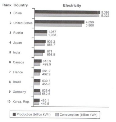
The bar chart below shows the top ten countries for the production and consumption of electricity in 2014.

Summarise the information by selecting and reporting the main features, and make comparisons where relevant.

Write at least 150 words.


SAMPLE ANSWER:


The bar chart compares 10 highest-ranking countries in terms of electricity generation and consumption in 2014.
Overall, the amounts of electricity produced and consumed in China and the US were far higher than the other nations. It is also noticeable that Germany was the only country that consumed more electricity than it generated.
Out of the 10 nations, China ranked first with the production and consumption of electricity being just over 5,300 billion kWh each. The US, the second largest electricity producer and consumer, generated 4,099 billion kWh and consumed 3,866 billion kWh.
Looking at the remaining countries, we can see that Russia was the only nation with electricity generation and consumption being just over 1,000 billion kWh each, followed by Japan and India, with the figures being slightly lower, ranging from 698.8 to 1,057 billion kWh. The figures for the other countries show a difference in production and consumption of electricity at around 50-150 billion kWh, while it is interesting to note that Germany produced 526.6 billion kWh of electricity, but it consumed 582.5 billion kWh.
(177 words, band 8.0, written by Nguyen Huyen)

Cambridge 13 Test 2 (Bar Graph/Chart)


You should spend about 20 minutes on this task.

The chart below shows the percentage of households in owned  and rented accommodation in England and Wales between 1918 and 2011.

Summarise the information by selecting and reporting the main features, and make comparisons where relevant.

Write at least 150 words.


SAMPLE ANSWER:
Source: essayforum.com

Given is the bar chart which compares the proportion of families who owned and rented an accommodation in two countries, England and Wales from 1918 to 2011.

Overall, it is immediately apparent that percentage of rented housing in the above two contries declined steadily in the given period. By contrast, the figure for owned accommodation incresed gradually in the same period.

In England and Wales, in 1918, people preferred to live in rented appartments and more than three-fourth housings were a rented one. On the other hand, just above 20 percent of households stayed in their own house in that year. Afterwards, whilst the percentage of rented accommodation experienced a fall, owned one showed a reverse trend and in 1971 it accounted for half of the total accommodation in England and Wales.

In the next four-decade period, there was almost 20 percent decrese and increase for rented and owned accommodation, respectively. So, more and more people were buying their own places . In the next decade, although the figure for tenants climbed up a little to reach just above 33 percent, it was almost twice less than its counterpart.

Cambridge 13 Test 1 (Map/Diagram)


You should spend about 20 minutes on this task.

The two maps below show road access to a city hospital in 2007 and in 2010.

Summarise the information by selecting and reporting the main features, and make comparisons where relevant.

Write at least 150 words.


SAMPLE ANSWER:
Source: essayforum.com

The two maps illustrate considerable changes of a city hospital's road over a three year period from 2007 to 2010.
Overall ,while the modifications brought with them the melioration of the car park, the road to access the hospital was totally expanded with the addition of the bus station. Moreover,the hospitstal road was transferred with two roundabouts

Over the period , it is noticeable that the car park, used to located in the eastern area , have been divided into two parts : staff car park and public car park .The old car park was demolished to make way for the staff car park while the public car park was preferably constructed alongside ring road. Another striking change is the addition of the bus station which was built to replace the bus stops is connected to the hospital road by two roundabouts.

Further down the north side , hardly have there been any signficant shifts in the city hospital as well as the traffic infrastructure.

Cambridge 12 Test 6 (Maps)

You should spend about 20 minutes on this task. The maps below show the centre of a small town called Islip as it is now, and plans fo...